Using the Ratings & Reviews configuration, you can customize how user-generated content (UGC) is displayed on your website. After you add the Bazaarvoice hosted display code to your website, you can configure and style the display. In particular, you can use the Style Detector and Style Editor to import and customize fonts, colors, borders, and background settings. You can also customize the text and labels displayed alongside Bazaarvoice content on your site.

- If you collect and display UGC in multiple locales and languages, be sure to style localized content after completing the steps in this section.
-
You can enable and configure the latest V2 Bazaarvoice hosted display if you have implemented the
bv.jsloader file. Contact Bazaarvoice support to get started.

Design considerations
We recommend that you design your content display to be the following:
Visible
Make ratings and reviews easy to find:
-
Use prominent stars that contrast with the dominant page color.
Accepting stars as your main rating graphic of choice boosts usability and your brand because the meaning of the star is ubiquitous and easily understood. Stars work for many different products and services, thanks to their generality. And stars can be styled with your brand's accent colors to help them stand out on a page.
- Display as many reviews as possible on each page without creating clutter (up to 10 reviews).
Scannable
Enable users to digest multiple reviews quickly:
- Design reviews so that each review has a clear visual fingerprint.
-
Use contrast in type (size, weight, and color) to convey hierarchy.
Mixing in new font sizes and colors to your style guide can boost usability. Variety helps to give the user a clear starting point and makes complex content easier to digest. It prevents information overload by highlighting primary elements (such as review titles) and scaling back less important elements (such as dates).
- Create visual anchors to make jumping from review to review easy. For example, add a Next Review button or prompt.
-
Use white space to define review regions.
White space is essential to making your content easier to scan and read because it:
- Defines and shapes review regions
- Makes the presentation of content more appealing and attractive
- Reduces eye fatigue when increasing the line height of the body copy to at least 150% of the font size
- Allows you to position elements both horizontally and vertically, helping to create logical groupings of similar content
- Display large review titles.
Personal
Emphasize the authentic, personal nature of the review content. To illustrate the idea that your reviews come from real people, use visual cues such as the following:
- Word bubbles
- Large quotation marks
- Italic text
- Avatar icons
- User information grouping
Engaging
Make relevant review information easy to find:
- Create large graphical elements.
- Use clear and inviting calls to action. For example, add "vote to promote" style buttons to promote helpful reviews.
- Provide an accessible design, so you can display more reviews without overwhelming users.
- Set type in narrow column widths.
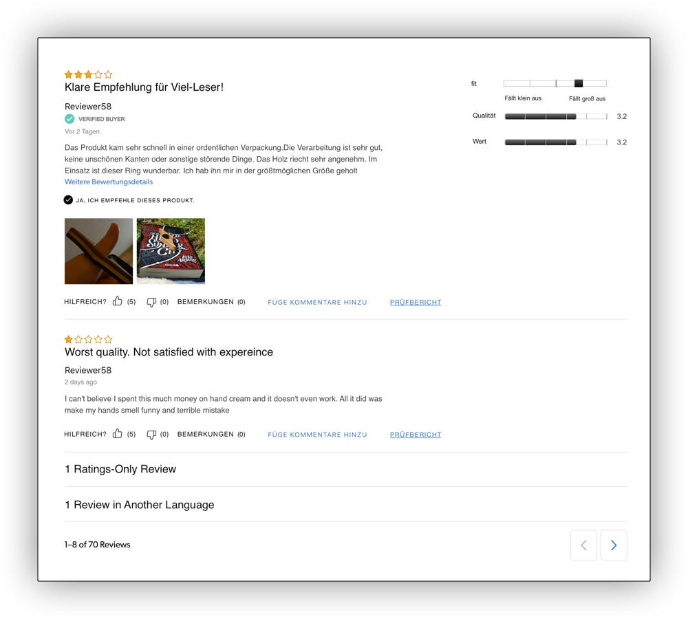
The following example shows a Ratings & Reviews display with reviews in different languages, reviews with content, and ratings-only reviews:
In addition, you can use the "blur test" to determine if customers can scan an implementation easily. An implementation with visual anchors and a clear information hierarchy creates a distinct fingerprint. It is easy for consumers to scan or quickly get the sentiment of multiple reviews without reading each one.
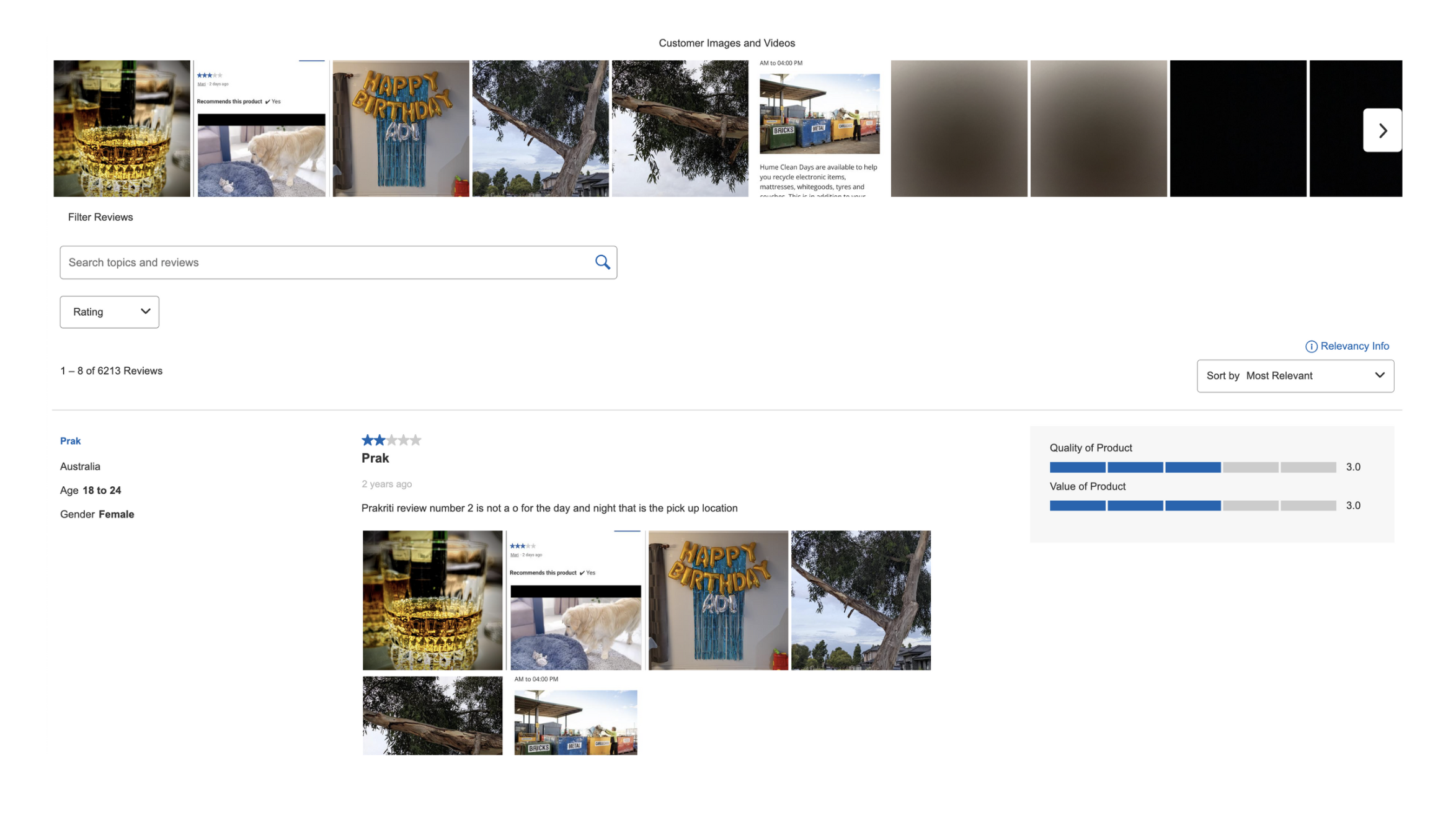
The following example shows a common design layout.
When you remove color and textual information from your layout, the ease of the design becomes apparent: