Display (V2) Background And Border Menu Options
You can configure these styles using Style Editor in the Bazaarvoice Portal:
-
Sign in to the Bazaarvoice Portal.
-
From the upper-right corner, select the settings icon.
-
Under Configuration, select Ratings & Reviews.
-
Under Implementations, select Edit next to the implementation you want to configure.
-
Select Style Editor in the User Experience section on the left.
Backgrounds menu options
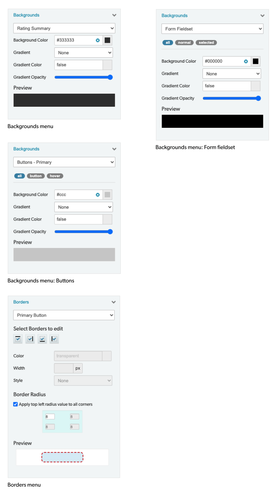
Select Backgounds menu options to select a background style. Example: Backgrounds > Background Color > #333333.
- Background Color: Select a background color from the palette or enter the hex code of the desired color.
- Gradient: Adds a gradient from Gradient Color to Background Color. Select whether the gradient should start at the Top or Bottom.
- Gradient Color: Select a color from the palette or enter the hex code of the desired color.
- Gradient Opacity: Set the opacity for the gradient.
Form Fieldset States
- All: Changes will be applied to all form fieldset states.
- Normal: Changes will be applied to default form fieldset state only.
- Selected: Changes will be applied to the active form fieldset state only.
Button States
- All: Changes will be applied to all button states.
- Button: Changes will be applied to default button state only.
- Hover: Changes will be applied to the hover button state only.
Borders menu options
Select Boders menu options to select a border style. Example: Borders > Color > transparent.
- Select borders to edit: Specify and enable/disable the top, bottom, left and/or right borders.
- Color: Select a border color from the palette or enter the hex code of the desired color.
- Width: Select a border width in pixels.
- Style: Select a border style from the dropdown: None, Hidden, Dotted, Dashed, Solid, Double, Groove, Ridge or Inset.
- Border Radius: Specify a border radius in pixels to add rounded corners to an object. Each corner can have different settings, or one setting can be applied for all corners.
|
|