- Sign in to the Bazaarvoice Portal.
- From the upper-right corner, select the settings icon.
- Under Configuration, select Ratings & Reviews.
- Under Implementations, select Edit next to the implementation you want to configure.
- Select Style Editor in the User Experience section on the left.
Icons
Select Icons to update the icon styles. Example: Icons > Review Stars > Full.
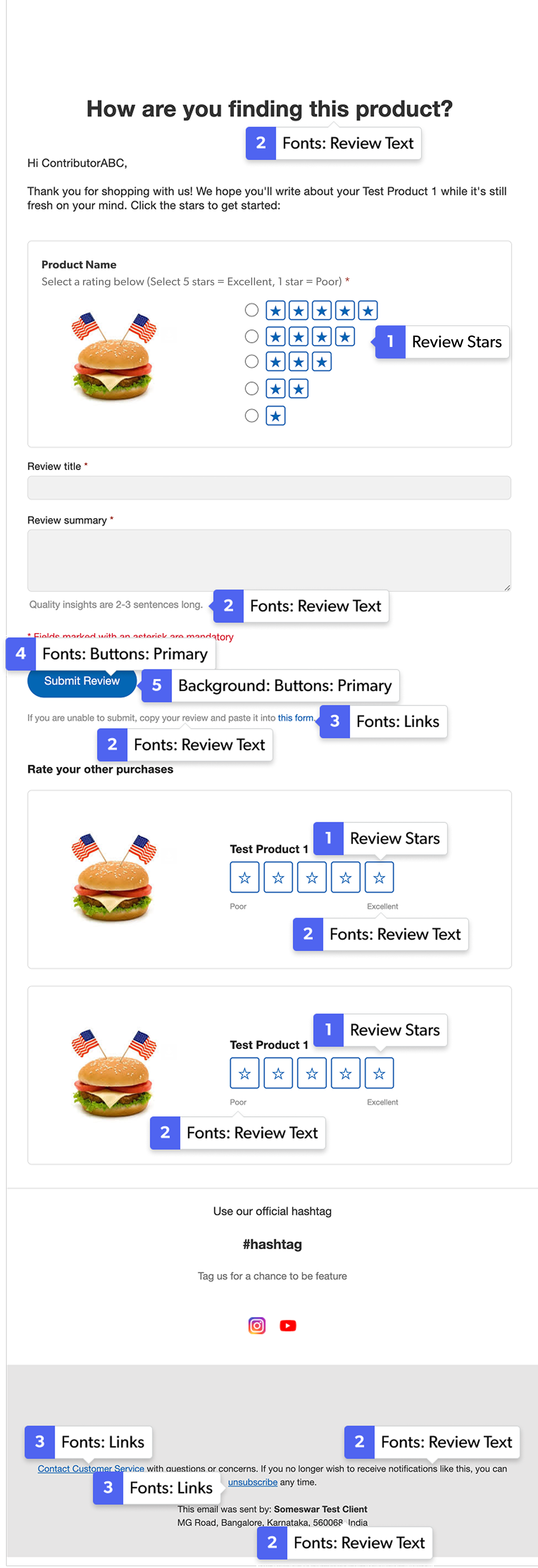
1. Review Stars
-
Full: The full star fill color is measured against the email background. For the stars next to the radio buttons, a slightly lighter version of the full star color is used on the filled stars. On hover and click, the filled stars are full color. For the clickable stars in the “Rate your other purchases” section, the full star color is used for stars when hovered over and clicked on.
Note: To meet accessibility standards and accommodate a broader range of brand colors, we allow a low contrast ratio (1.2:1) for the review stars full color. If the contrast ratio is lower than 1.2:1, or if an element is transparent, the fallback color #444 (dark gray) is used. -
Empty: The empty star color is used for the star color outline in the stars next to the radio buttons. The empty star outline color is also used in the “Rate your other purchases” section.
Note: To meet accessibility standards and accommodate a broader range of brand colors, we allow a low contrast ratio (1.2:1) for the review stars outline color. This helps prevent white-on-white and transparency issues while still accepting common, low-contrast color combinations if desired. If the contrast ratio is lower than 1.2:1, or if an element is transparent, the fallback color #CCC (light gray) is used.
Fonts
Select Fonts to update the font styles. Example: Fonts > Review Text.
2. Review Text
This color is used for the main text colors in the email.
A slightly lighter version of this color is used for the following text.
- “Can’t enter text?” message under “Your review.”
- “Quality insights are...” text under the review text field.
- “If you are unable to submit...” text under the Submit button.
- “Start rating” text under the clickable stars.
- Non-linked text in the footer.
3. Links
This color is used for all link colors in the email.
Note: To avoid color combinations that do not meet accessibility standards, we allow for a contrast ratio of 4.5:1 for all elements. If the contrast ratio is lower than 4.5:1, or if an element is transparent, the fallback color #0066B4 (blue) is used.
4. Buttons: Primary
This color is used for the text color of the buttons. For example, the “WRITE A REVIEW” button.
Note: To avoid color combinations that do not meet accessibility standards, we allow for a contrast ratio of 4.5:1 for all elements. If the contrast ratio is lower than 4.5:1, or if an element is transparent, the fallback color #fff (very light gray) is used.
Backgrounds
Select Backgrounds to update the background styles. Example: Backgrounds > Buttons - Primary.
5. Buttons: Primary
This color is used for the button backgrounds.
- On some iOS devices, a disabled button is indicated using a slightly lighter background color based on the primary button color.