Display (V2) Review Submission - Other Sections
You can configure these styles using Style Editor in the Bazaarvoice Portal:
-
Sign in to the Bazaarvoice Portal.
-
From the upper-right corner, select the settings icon.
-
Under Configuration, select Ratings & Reviews.
-
Under Implementations, select Edit next to the implementation you want to configure.
-
Select Style Editor in the User Experience section on the left.
Fonts
Select Fonts to update the following styles. Example: Fonts > Form Fieldset Label.
1. Form Fieldset Label
2. Section Header
3. Section Header Controls
4. Review Text
5. Labels
Affects border color for Upload and Uploaded photos.
6. Dimension Values
The default setting has a transparent background, with the font and border color being the same as the applied color. When a pill is selected, the colors invert, resulting in the background taking on the applied color while the font color changes to a default white.
7. Links
8. Buttons - Primary
9. Buttons - Secondary
10. Validation - Success
For Success icons, only color can be modified.
11. Validation - Error
For Error messages below inputs, error text and icon color and size and input border colors are modified by this setting.
For Error messages in popups, only color can be modified.
12. Buttons - Primary
-
For the Edit button, the "Edit" text size and other font styles are modified by the Fonts > Button primary > button > Size setting.
-
For the Edit button, the font color and border color are modified by the Backgrounds > Button primary > button > Color setting.
- For the Photo upload "x" (Close) icon, the icon color is modified by the Fonts > Button primary > button > Color setting. It uses the font color of button primary.
Backgrounds
Select Backgrounds to update the following styles. Example: Backgrounds > Buttons - Primary.
13. Buttons - Primary
14. Buttons - Secondary
Badge Styles
Select Fonts to update the following styles. Example: Fonts > Status Badge - Completed.
15. Fonts: Status Badge - Completed, Background/Borders: Badge - Completed
16. Fonts: Status Badge - In Progress, Background/Borders: Badge - In Progress
17. Fonts: Status Badge - Skipped, Background/Borders: Badge - Skipped
For badge borders, only border radius is configured. Completed and Skipped badges use background color as border color. In Progress badge uses font color as border color.
Icons
Select Icons to update the following styles. Example: Icons > Bars.
18. Bars
The empty color is used for info icons and calendar icons.
Any changes outside of the list above cannot be done.
|
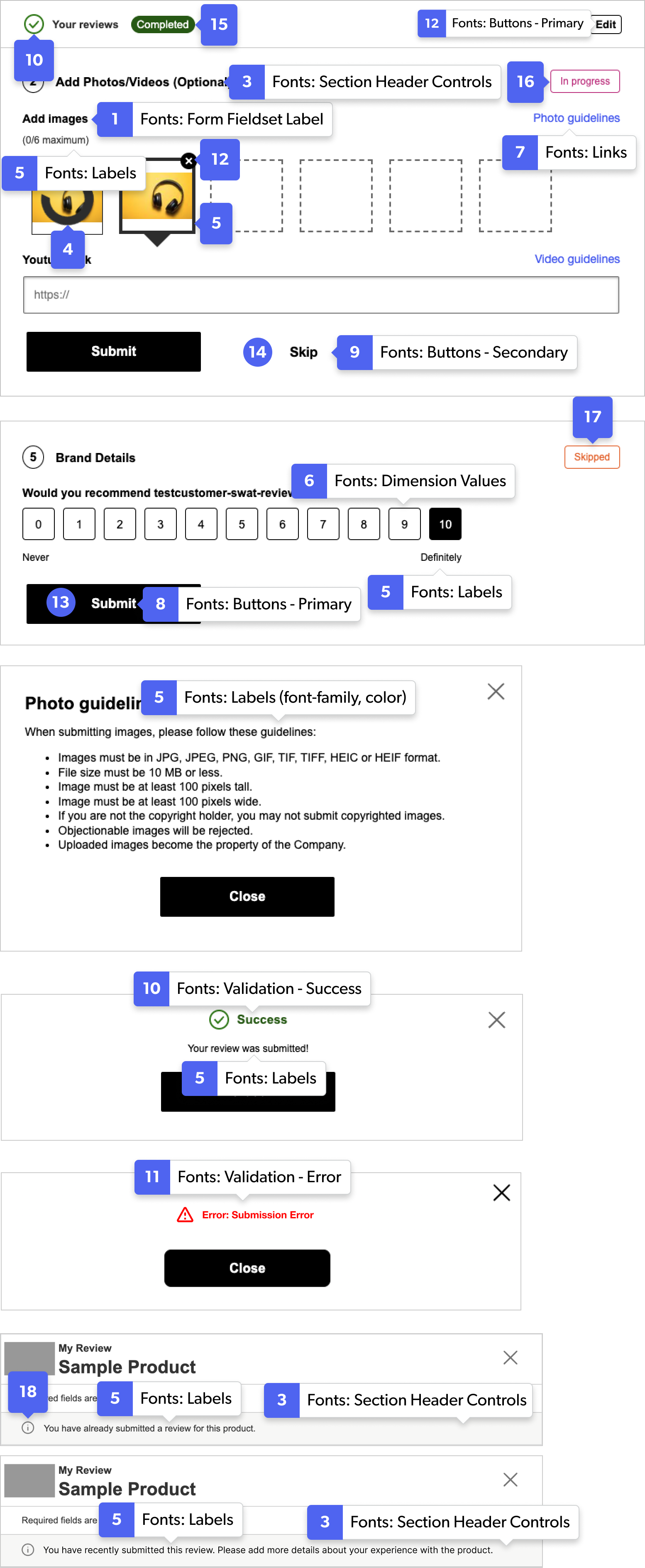
Review submission form examples
|