When you navigate to Insights, you arrive at the Program Overview page. This page is customized to display metrics available for your program and provides an aggregated, high-level summary of key metrics.
The following table lists each card and the metrics it displays.
Note: Cards are displayed or hidden depending on the available data for your instance.
Card
|
Description
|
Reviews collected
|
Displays the total number of reviews you collected for your products within the selected date range. From this card you can:
-
Use the trend percentage figure to find out the change in the number of reviews collected in the last 30 days compared to the previous 30 days.
-
Use the figure beside the benchmark icon  to see the industry benchmark for average monthly reviews collected. to see the industry benchmark for average monthly reviews collected.
-
Hover over the line graph to see a breakdown of the number of native, network, and total reviews collected for each day.
-
Hover over the clock icon  to see the time period for the data in the card. to see the time period for the data in the card.
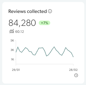
From the example image, we've learned that: - Reviews collected - This company has collected 84,280 reviews in the 30 day period.
- Trend - This was a 7% increase in reviews collected compared to the previous 30 days.
- Benchmark - The average monthly review collection for other companies in their industry was 60.12 for the quarter, which means they are above the industry standard.
- Line graph - From the line graph, they can view the daily trends over the 30 day period.
- Time period - This card is displaying data from January 29th to February 28th of 2026.
Click anywhere on the card to view your Collection insights.
|
Product rating (Your site)
|
Average rating of products on your site with displayable reviews. From this card you can:
- Use the trend percentage figure to find out the change in the average product rating on your site in the last 30 days compared to the previous 30 days.
-
Use the figure beside the benchmark icon to see the industry benchmark for average product rating.
-
Hover over the percentage bars to see how many ratings were collected for each star rating and the breakdown of how many were native or syndicated reviews.
-
Hover over the clock icon to see when data was last collected for this metric.
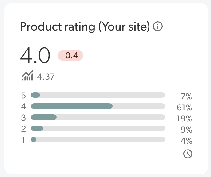
From the example image, we've learned that: - Product rating - This company's products on their site have an average product rating of 4 stars for displayable reviews collected in the last 30 days.
- Trend - There has been a 0.4 rating decline in their average rating compared to the previous 30 days.
- Benchmark - The average product rating for other companies in their industry was 4.37 stars for the quarter, which means they are below the industry standard.
- Percentage bars - From the percentage bars, they can view the breakdown of reviews for each star rating. For example, 61% of reviews in the last 30 days were 4 star ratings.
- Time period - This card is displaying data for the last 30 days.
Click anywhere on the card to view Sentiment insights on your site.
|
Product rating (Network) |
Average rating of your products on the Bazaarvoice Network with displayable reviews. From this card you can:
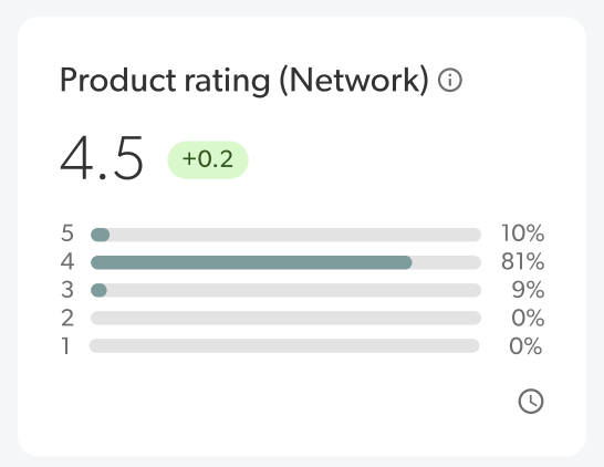
From the example image, we've learned that: - Product rating - This company's products on the Bazaarvoice Network has an average product rating of 4.5 stars for displayable reviews collected in the last 30 days. This also shows the company the benefit syndicating reviews to the Bazaarvoice Network.
- Trend - There has been a 0.2 rating increase in their average rating compared to the previous 30 days.
- Percentage bars - From the percentage bars, they can view the breakdown of reviews for each star rating. For example, 81% of reviews in the last 30 days were 4 star ratings.
- Time period - This card is displaying data for the last 30 days.
Click anywhere on the card to view Sentiment insights on your site. |
Product coverage (Your site)
|
Percentage of products on your site that have at least one review through native collection, syndication, and shared reviews from product families. From the card you can:
- Use the trend percentage figure to find out the change in product coverage on your site in the last 30 days compared to the previous 30 days.
-
Use the figure beside the benchmark icon to see the industry benchmark for product coverage.
-
Hover over the percentage bars to see what percentage of reviews were collected from customers on your site or syndicated from the Bazaarvoice Network.
-
Hover over the clock icon to see when data was last collected for this metric.
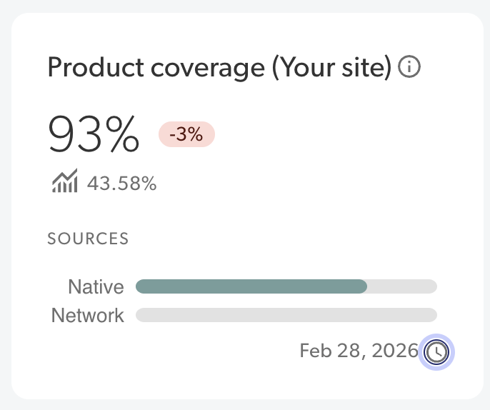
From the example image, we've learned that: - Product coverage - 93% of this company's active products have at least one displayable review as of the last 30 days.
- Trend - There has been a 3% decline in the number of products with reviews compared to the previous 30 days.
- Benchmark - The average product coverage for other companies in their industry was 43.58% for the quarter, which means they are above the industry standard.
- Percentage bars - From the percentage bars, they can view the breakdown of native and network reviews.
- Time period - This card is displaying data for the last 30 days from Feb 28th, 2026.
Click anywhere on the card to view your Coverage insights.
|
Unanswered questions 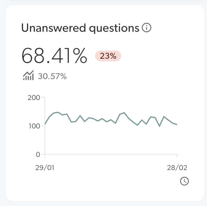
|
Displays the total number of questions from your customers that haven’t received an answer. From this card you can:
-
Use the trend percentage figure to find out the change to the number of unanswered questions collected in the last 30 days compared to the previous 30 days.
-
Use the figure beside the benchmark icon to see the industry benchmark for unanswered questions.
-
Hover over the line graph to see the total number of questions and unanswered questions for each day.
-
Hover over the clock icon to see the time period for the data in the card.
From the example image, we've learned that: - Unanswered questions - 68% of this company's questions do not have an answer the 30 day period.
- Trend - This was a 23% decline in answered questions compared to the previous 30 days.
- Benchmark - The average percentage of questions without an answer for other companies in their industry was 30.57% for the quarter, which means they are above the industry standard.
- Line graph - From the line graph, they can view the daily trends over the 30 day period, as well as a breakdown of total questions versus answered questions for each day.
- Time period - This card is displaying data from January 29th to February 28th of 2026.
Click anywhere on the card to view your Response insights.
|
Visitor engagement 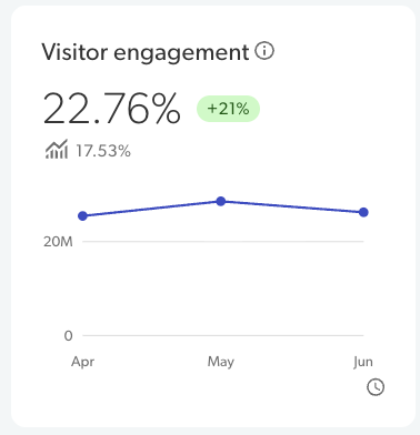
| Displays the total percentage of visitors that actively or passively engaged with Bazaarvoice content on your site in the last three months.
From this card you can: Use the trend percentage figure to find out the change in visitor engagement compared to the previous three months. Use the figure beside the benchmark icon to see the industry benchmark for visitor engagement. Hover over the line graph to see the number of visitors and the engagement breakdown for each month. Hover over the clock icon to see the time period for the data in the card.
From the example image, we've learned that: Visitor engagement- 22.76% of visitors to your site in the last 3 months actively or passively engaged with Bazaarvoice content. Trend - This was a 21% increase compared to the previous three months. Benchmark - The average percentage of visitor engagement for other companies in their industry was 17.53% for the quarter, which means they are above the industry standard. Line graph - From the line graph, they can view the monthly trends over the three month period.
Click anywhere on the card to view your Conversion insights.
|
Recency coverage (Your site)
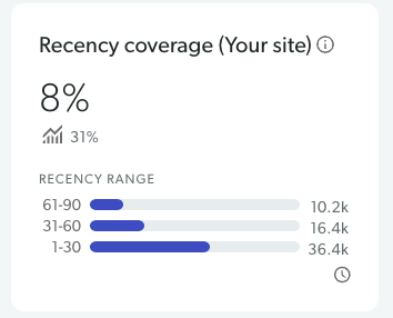
| Percentage of active products on your site that have received reviews in the last 90 days. Use the Recency Range chart to view how many products received reviews within the last 30 days, from 31-60 days ago, or from 61-90 days ago. Hover over the recency ranges to view: The number of products with native reviews The number of products with Network reviews The percentage of page views that are related to products with reviews in the selected time period
- Use the figure beside the benchmark icon to view the industry benchmark for recent approved displayable reviews.
- Hover over the clock icon to view the time period for the data in the card.
From the example image, we’ve learned that: Recency coverage - 8% of this company’s products have received at least one review in the last 90 days. Recency range - 10.2k products received a review 61-90 days ago, 16.4k products received a review 31-60 days ago, and 36.4k products received a review in the last 30 days. Benchmark - The recency coverage for other companies in their industry was 31% for the quarter, which means they are below the industry standard. Time period - This card is displaying data for the last 90 days.
Click anywhere on the card to view your recency coverage in coverage insights.
|